EDITOR’S EYE: A Collector Makes the Napa Valley Home
“Sometimes your best ideas come from
the necessity of being resourceful
and the innovative thinking that incubates in a challenge.”
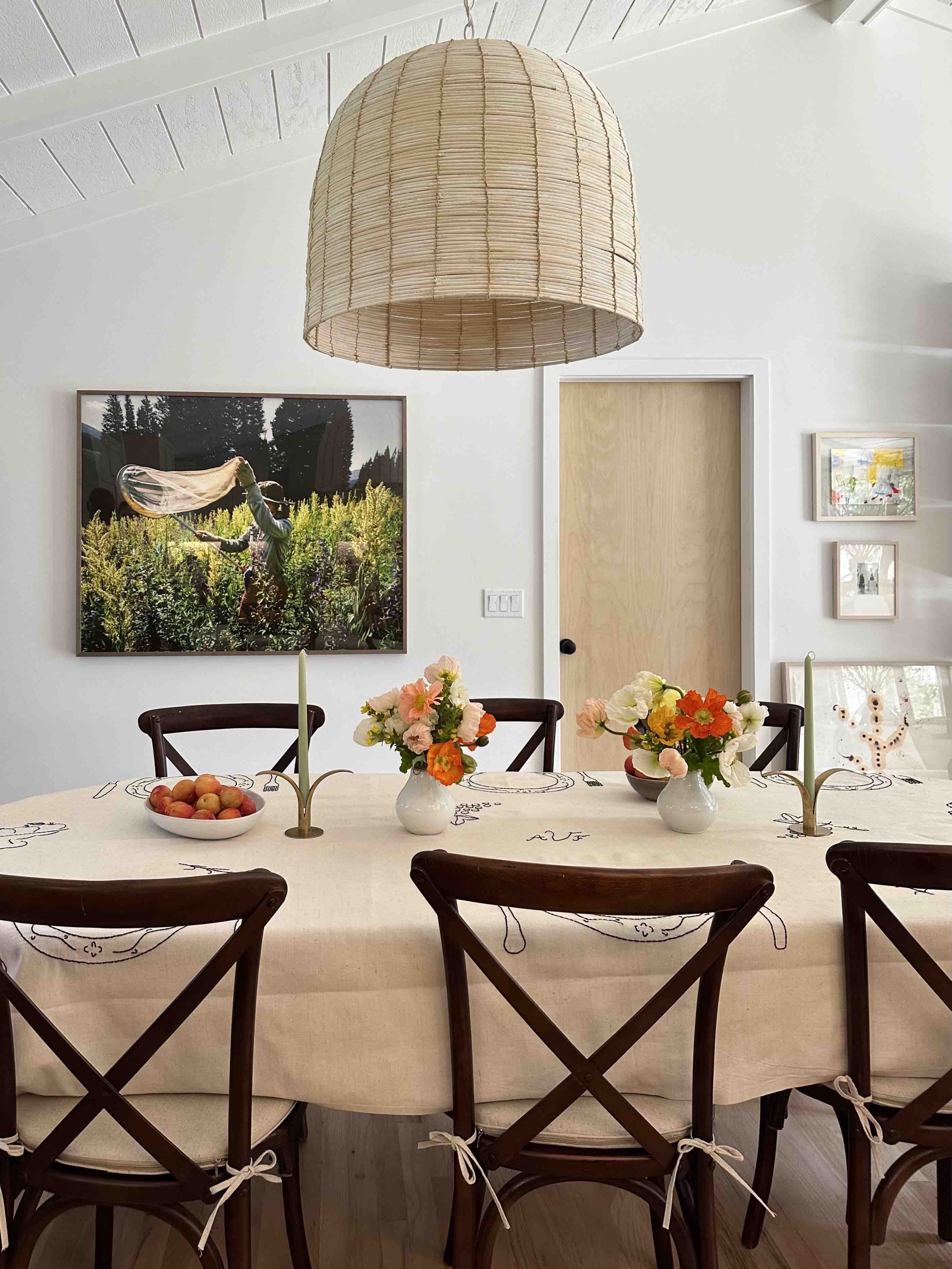
I was in California last week to visit several clients, install some new acquisitions, and to celebrate them, too. It was a wonderful, full-circle visit. There’s a project in Napa that is very dear to my heart. The clients who live there have such impeccable taste, and are naturals when it comes to collecting art—she’s a graduate of RISD and he hails from Cognac, France—their home is such a beautiful transformation from top to bottom, and a perfect example of how an intimate, domestic scale can really benefit from an editor’s eye.
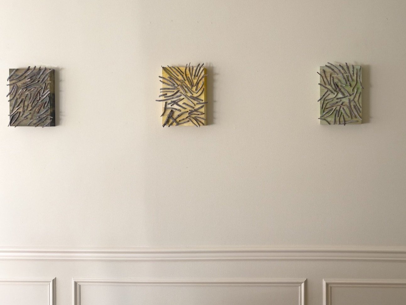
Over the four years I lived in San Francisco, we became very close and when they finally bought their first home, it was truly such a pleasure and an honor to consult with them to bring their classic single-owner (!) 1960s California cottage ranch into the 21st century with a considered reimagining of the architecture, thoughtful updates and changes to the rooms, layouts and functions of their new home as well as where and how to display their enviable, eclectic art collection.
It was a wonderful partnership and house transformation (everything inside and out was mint green when we started) and I’m so delighted to share it with you here.
Bringing the charm (and the 21st century) into a classic California ranch
One of the things that I loved about this consultation project was the constraints. Sometimes your best ideas come from the necessity of being resourceful and the innovative thinking that incubates in a challenge. Mindful of budget, we approached the plan in multiple phases, allowing them the potential to grow into the home. To modernize and open up the cluster of small living spaces in the main part of the house, we looked to the modernist mid-century ranch style popularized by Cliff May, toning down the cookie-cutter cottage roots of the house without erasing them completely.
Though not originally in the budget, I managed to convince them that they really needed to prioritize raising the ceilings (a very low-slung, dark, eight feet). Some big projects just need to be tackled when a house is vacant and being completely reworked—this was that moment for the central living area of the house. We’re all so happy they went for it!
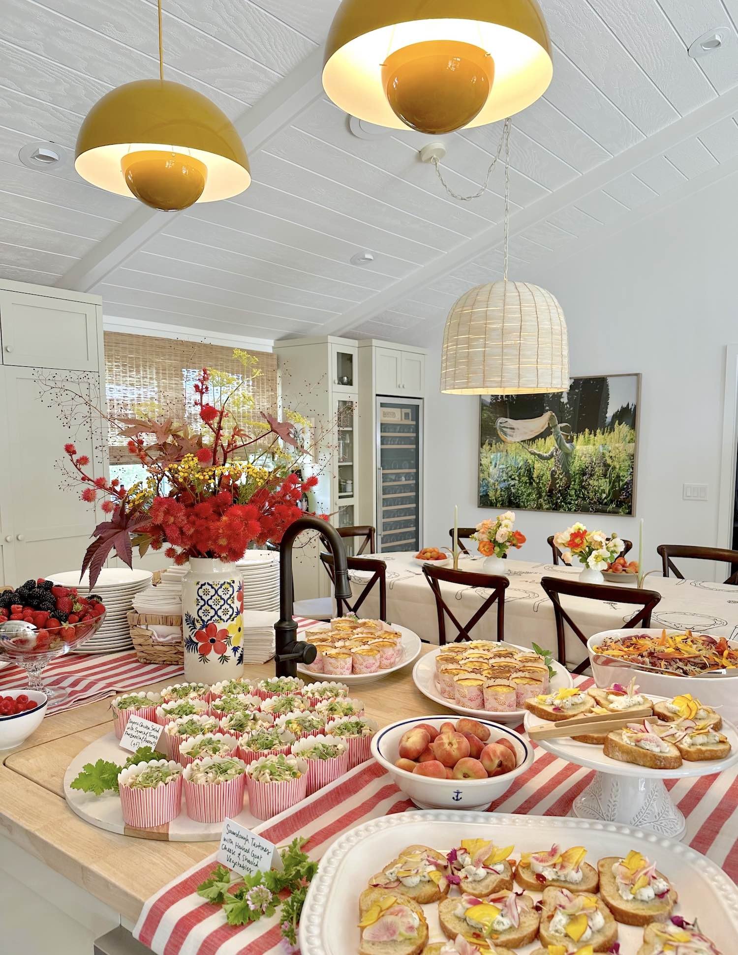
The central kitchen island, ready for entertaining
The partition walls dividing the kitchen, living, and dining areas were removed and the orientation of the kitchen was shifted toward the front corner of the room, opening up the central part of the house for easy entertaining. The windows along the back wall of the house were expanded and converted to a pair of glass doors, each with flanking floor to ceiling windows looking out onto the large backyard— enabling a transformative increase of natural light and indoor-outdoor living that is so synonymous with the best of California living. Now, with its soaring ceilings, you’d never know the house has such a petite footprint.
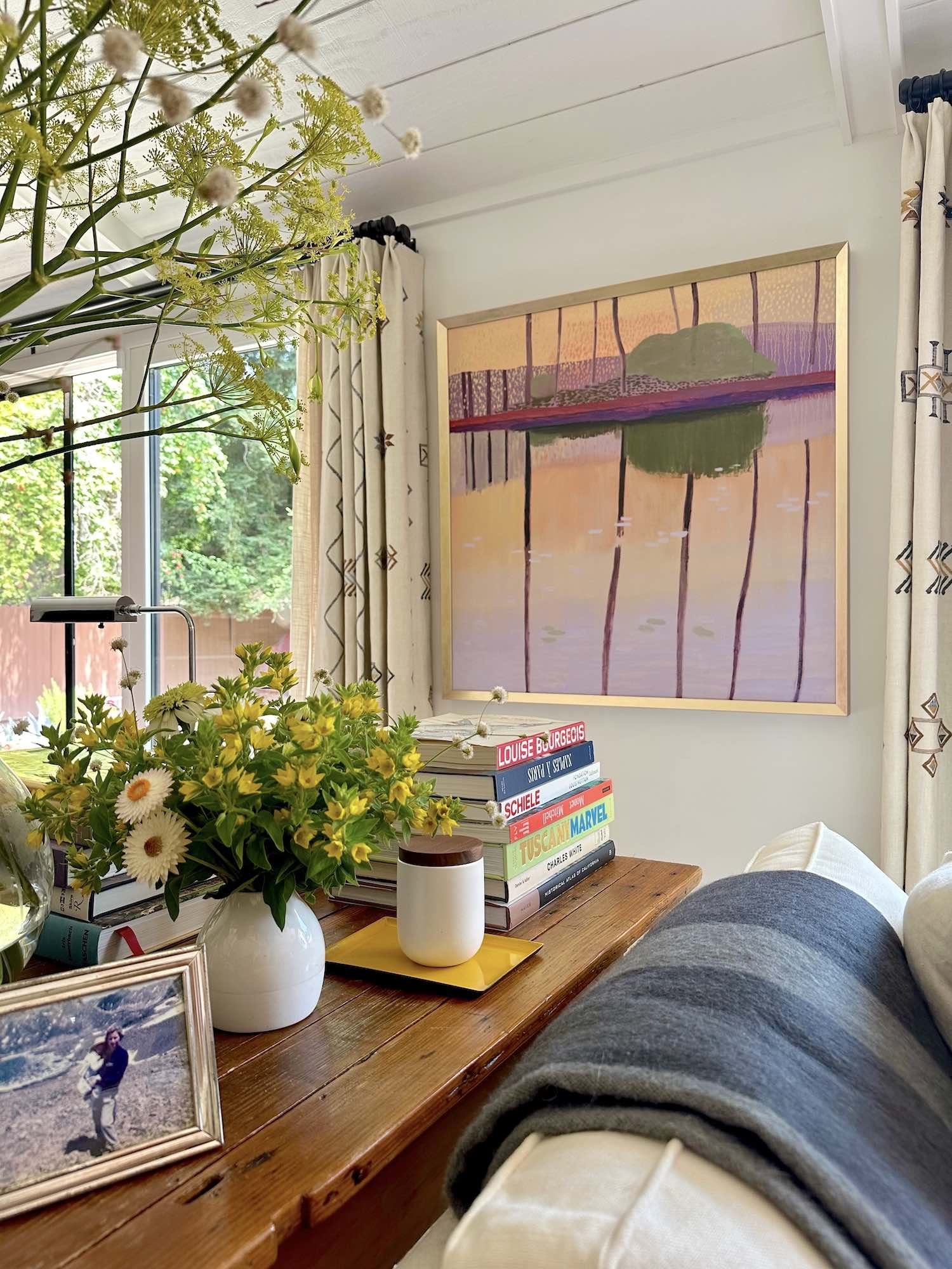
Throughout, we made a fresh nod to the house's mid-century roots without hewing too closely to the “California Modern” style that has become so ubiquitous. When the opportunity arose, we incorporated family pieces like a wonderfully rustic narrow antique harvest table, into the floorplan. Too small for a dining table, it became the perfect transition piece between the two seating areas that define the long, narrow living space.
The clients wanted the home to feel cozy, collected, and warm, and the charm is evident in every choice—especially in her signature pops of cheerful yellow, the vintage light fixtures, and the large-scale St. Frank fabrics selected for the curtain stacks and pillows.
The next phases include a primary bedroom suite and a music conservatory/study (she is a concert pianist) and the addition of a pool and low-water landscaped garden. But first, there’s a baby on the way, and an office that needs converting to a nursery…
DID YOU KNOW WE OFFER INTERIORS CONSULTATIONS?
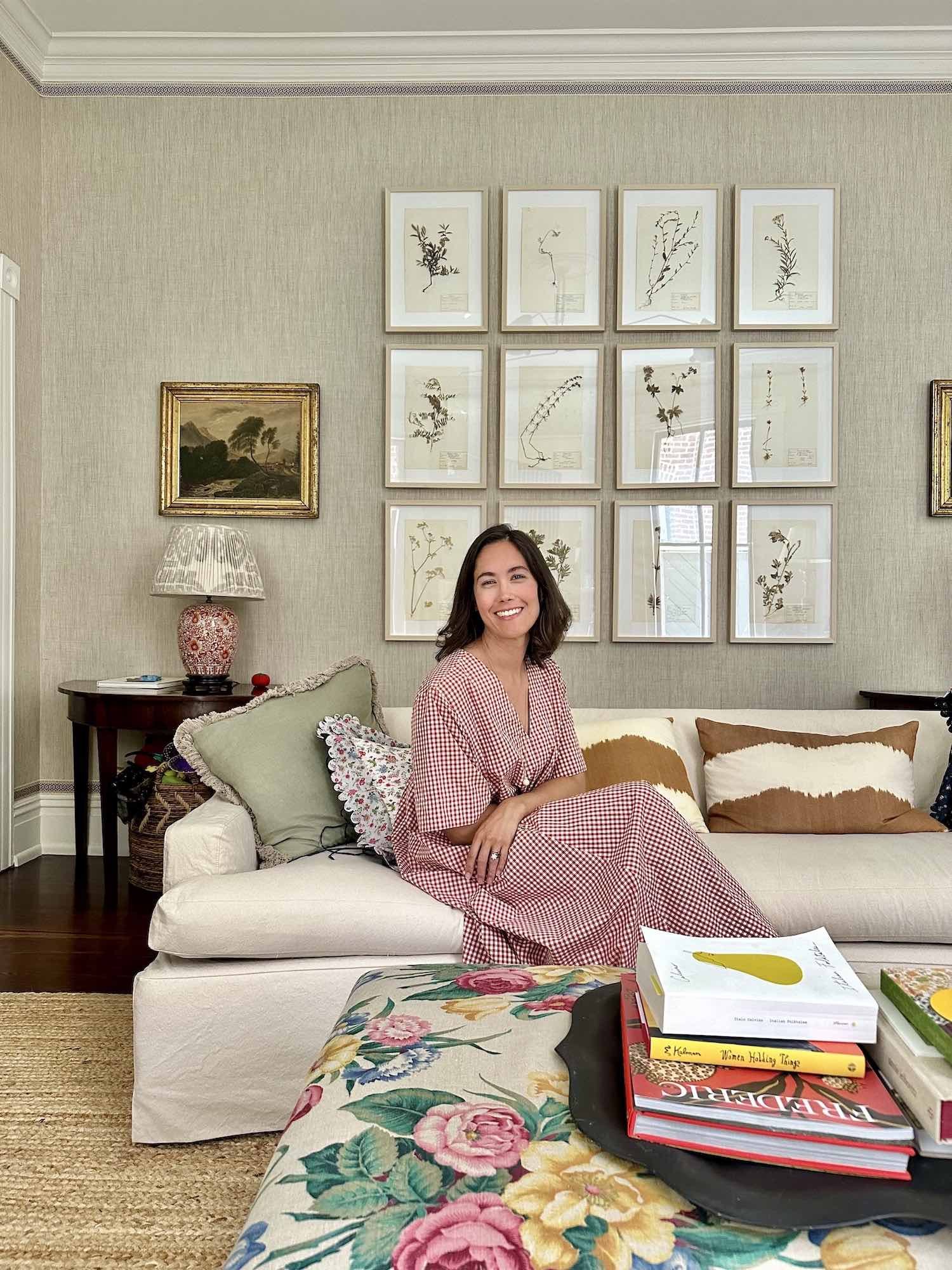
Art/artefact is a nationally recognized art advisory and interior design practice founded by Audra Kiewiet de Jonge and known for placing a great collection at the heart of every interior.
Formally trained as a painter and an art historian, Audra’s modern sensibility is informed by her historical perspective—bringing art and objects into context and conversation with the way we live today.
Working with private and corporate clients nationally, our interiors are meticulously curated and expertly built to be high on artistry, but not on pretense.
Email Audra with more information about your consultation project: audra@artartefact.com.


